Ariane Andong

BÉBÉ VOYAGE


Overview

Bébé Voyage started out as a Facebook group of parents who shared advice about how to travel with kids. The Facebook group soon grew into a community with over 20,000 members. Parents from all over the world were sharing recommendations, tips, advice, itineraries, coupons and anything and everything related to travel. Their website currently has a ton of advice for traveling with baby gear, how to deal with baby jet lag and any other problems moms face during their family travels. Most of these articles are written by parents from different parts of the world.

Bebe Voyage is a responsive website for parents who frequently travel with their children, providing parents with recommendations with kid-friendly activities when traveling as a family.


My Role

UX Design, UX Research, Information Architecture, Interaction Design

Platform

Responsive Web

Tools

Figma, HotJar, Google Analytics


love this for web.png
 

 THE PROBLEM

Designing To Add Value & Convert Users

Bébé Voyage needed our help to design an experience to turn free users into paid members. They wanted to increase revenue by creating a 3-tiered membership subscription. We looked at ways that can be accomplished along with determining how to add value to users.

The client is a planning on rolling out a paid membership subscription that included the following:


Discounts for baby gear

Advice from health experts

An ambassador program


The main goal is to get the 20,000+ user base from their Facebook group to sign up for a membership.

I worked with 5 stakeholders, an engineer and another designer in order to design this experience.


RESEARCH

Getting To Know The Parents

Our aim was to understand how parents plan and travel with their kids. We also wanted to determine what they find the most valuable when they are planning for a trip with their family.


6 Stakeholders


We were provided a list of stakeholders (writers for the website, friends etc.) to contact and interview.

4 End Users

We interviewed 4 end users as the COVID pandemic was happening simultaneously during this project.

10 interviews


All parents that were interviewed were also part of the client's Facebook group.


Interview Insights

During the interviews, we discovered a lot of qualitative data. We took these findings and created an affinity diagram.


Research Takeaways


After creating an affinity diagram, we learned that parents:


[End users] didn’t realize that the client’s website existed

Preferred one-time purchases such as trip add-ons vs. paying for subscription

Were weary & skeptical about the value they’d receive from a subscription

Had difficulty finding kid-friendly activities

Value 1 on 1 personal recommendations from other parents who travel with kids

Had difficulty navigating the client’s current website


Reviewing The Analytics

We met with the client’s data science analyst and we learned that the site had an 85% bounce rate, which is very high for e-commerce but average for a blog like Bébé Voyage. She also mentioned that most users are coming through from organic traffic.

After checking Google Analytics, we found that new users account for most of the sessions on the site. They’re mostly mobile users. We also learned that the average user spends 1 minute or less on the site.

This meant that people were landing on a blog article and then leaving the blog page right after. They weren’t interested in exploring the site any further than the page they landed on.

 
Analytics@1x.png


How can we present valuable information to retain new users?


Wireframes

Since Google Analytics showed that the traffic on the site were mostly new users on mobile, we prioritized a mobile-first design.

A conversation with the client brought about the importance of highlighting the ambassador program as they were about to roll out the program in the next month.

With this in mind, we designed a homepage that includes:

  • An explanation of how the ambassador program works

  • The 3 tiers of membership

  • Destinations where ambassadors are located

 
How it works wireframe.png
pricing wireframe.png
Destinations wireframe.png


Gauging Interest Through Testing

Since most people’s first interaction with the site is landing on a blog article, we made sure to also incorporate the blog on the homepage. After showing this design to the client, we were given permission to start testing with parents from the the client’s Facebook group.


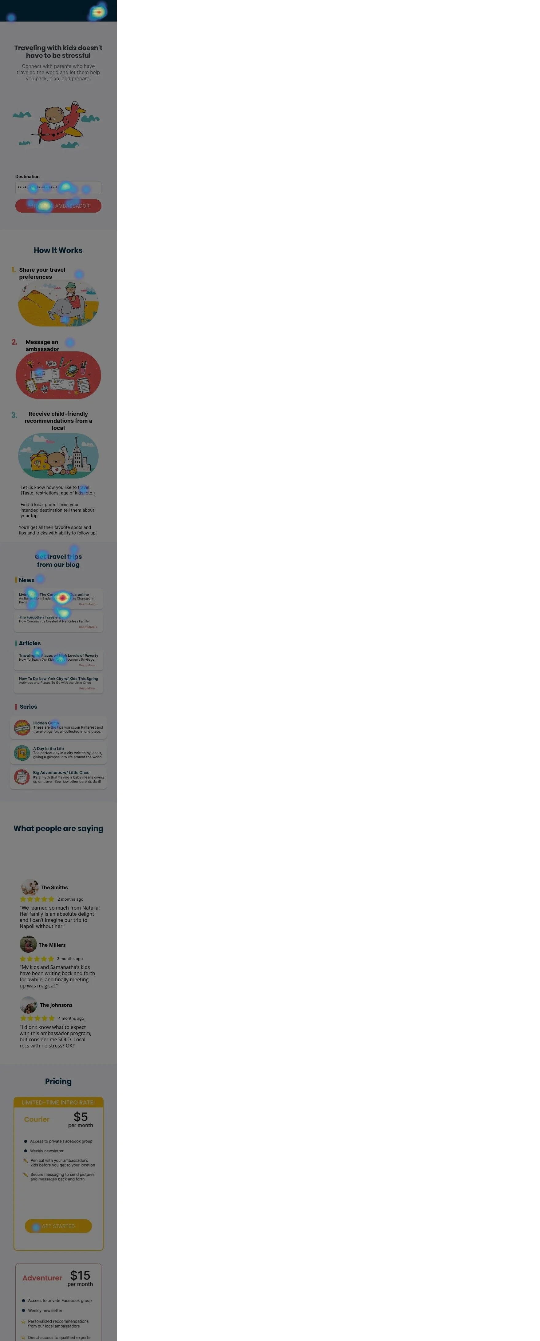
We used HotJar to see where users were clicking and to gauge their interest in the upcoming membership program.  


Mobile and Desktop Heat Maps


heatmap-5645402-click-desktop.jpg
heatmap-5645402-click-phone+%281%29.jpg
 

Heat Map Results

I posted a link on the Facebook group to run the test on the landing page. HotJar logged 74 heat maps in which 73% were mobile users and 27% were desktop users.

Group 248.png

With the highest amount of clicks on the COVID article, these results show that parents still looked to Bébé Voyage for the latest travel updates.

The second highest amount of clicks went to the “Find Your Ambassador” CTA which meant that users were interested in the upcoming Ambassador program. This shows that parents consider Bébé Voyage as one of their resources when traveling and are interested in speaking with an ambassador. This number would probably be higher were we not in a pandemic.

ITERATION

Designing For Retention and Adding Value

How do we add value? During a brainstorm session with the client, we discussed possible ways to add value for the user in order to drive them to sign up for the membership. We raised several issues—user’s pain points, travel planning behaviors, and relatively high drop-off rates.

Heat map results showed high interaction with the blog articles. How can we retain users as soon as they’re done reading the blog article they landed on?

To keep users engaged, I designed customized CTAs to be placed at the end of every blog article.


USER FLOW


User flow sign up.png


I designed the CTAs in order to drive conversion. I made sure that each CTA was tailored to the specific blog article that the user was reading.


The main feedback we received from end users was how difficult it was to navigate the current site. We wanted to simplify this experience as it contributes to the high bounce rate.

With retention in mind, I designed a proposed site map with revised information architecture that reduces cognitive load and makes it easier to navigate.


Current Site Map


Proposed Site Map


HANDOFF

Final Product


Measuring Success & Future Recommendations

As this site is currently in the process of being rebuilt, we cannot measure the success of our latest designs yet. Some recommendations that we made to the client were:


1) Have a free trial or an add-on option.

This allows parents to test out the service of the ambassador program as well as experience other perks included in the membership. This could also be the starting point of measuring success metrics.

2) Conduct additional UX/CX interviews.

Since this project coincided with the COVID outbreak, it became difficult for us to schedule interviews with parents who had to adjust to having their kids stay home from school. Some additional UX/CX interviews will be helpful in understanding what parents actually value when they travel.

3) Reorganize blog posts into easily definable categories.

Our usability testing and heuristic evaluation revealed that it was difficult to find information on the site. I created a proposed site map that could help with this.