Ariane Andong
 

BLUME


Overview

Studies have shown that there are many benefits to owning plants. Reducing stress boosting one’s mood are just some of them. Plants also bring a calming energy and a sense of peace to a space. It’s no wonder why many people prefer to keep these little green friends around their home. Our plants are only able to provide these health benefits as long as they are healthy themselves.

Blume is an iOS native app that helps plant owners maintain a consistent plant care routine to keep their plants healthy and thriving. It allows plant owners to create a task schedule tailored to their specific plants and set notifications when it’s time to do them.


Platform

iOS App

My Role

Research, User Flows, Information Architecture, Interaction Design, Prototyping, Usability Testing

Tools

Figma, Whiteboard, Pen, Paper


LIGHT PURPLE COVER.png
 

The Problem

As our lives become filled with meetings, deadlines, reports, gym sessions, and brunch dates, there's a high chance that we might forget about taking care of our little friends who provide us with peace and balance. Busy plant owners need a way to keep track of their plant care routine because it’s hard for them to keep up with their busy lifestyle and remember to attend to their plants.

High Level Goals

I collaborated with two UI designers to achieve some high-level goals:

1) Provide the plant owner easy access to plant care information.

2) Help plant owner create and maintain a plant care routine.


USER RESEARCH

Interviewing Plant Owners & Gathering Data

I visited different plant nurseries and interviewed different plant owners to determine what they do in their plant care routine and how they maintain plant health. I aimed to find out how they were getting information on how to take care of specific plants. I conducted a total of 6 interviews, all of whom were busy working professionals.

The interviews allowed me to gain a deeper understanding of a plant owner’s behaviors and methods when it comes to keeping their little green friends alive.


After synthesizing the research in an affinity diagram, I found that the main takeaways were:


Calendar.png

Plant owners can’t remember when to water their plants and how frequently they need it.

Leaf.png

Plant owners struggle with trying to determine what’s wrong with their plants.

WEbsite.png

Plant websites are very lengthy with small fonts which makes it hard to find information.


PERSONA

Meet Beatrice

I used the findings from the interviews to construct a persona so I could help plant owners ease their frustrations and achieve their goals.

Beatrice is a full-time marketing manager who strives to keep her plants healthy while also balancing a busy schedule.


DEFINE


Defining User Needs and Prioritizing Features

As I ideated and brainstormed, I designed different features that enable plant owners to have easy access to necessary information and have more control in their plant care routine.


Information Architecture

After identifying which features the busy plant owner needed most, I mapped out the information architecture. This helped me determine which flows I needed to develop first and roughly how long it will take.


User Flow

I developed a user flow that allows for a seamless user experience. I focused on the plant owner’s ability to add a plant to their plant family as well as being able to create a task schedule. I created this flow to accommodate two types of users:

New users can start building their plant family right after sign up and onboarding with the help of a little plant named Blume.

Current users can maintain their plant care routine by setting notifications for specific tasks.

Both new and current users can connect with a community of plant owners and can easily identify what their plant needs when it's showing signs of health issues (i.e. leaves turning brown or becoming droopy).


IDEATION AND BRAINSTORMING

Sketching

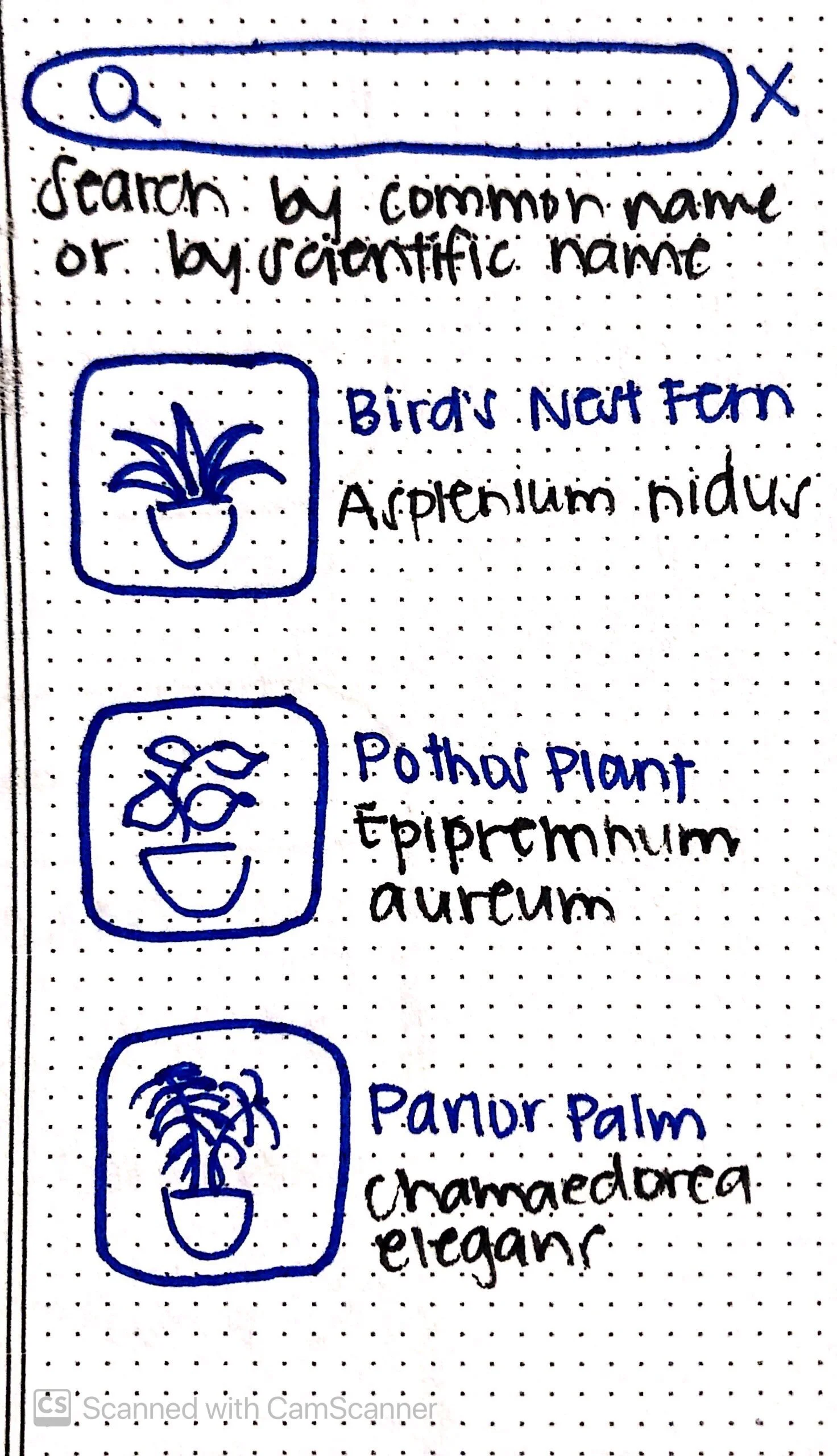
After gathering the information I needed, I ideated and sketched out some screens that corresponded with the user flow. I focused on simplifying the plant care routine by allowing the plant owner to easily add and edit the frequency of tasks.

 
IMG_7334.JPG
IMG_7332.JPG
IMG_7333.JPG
IMG_7335.JPG


Wireframes

I turned my sketches into mid-fidelity wireframes and really placed my focused on two flows: Add A Plant and Schedule Tasks. I also designed a friendly helper named ‘Blume” who greets the new user after sign up. Guiding instructions pop up multiple times as the first-time user explores the app.

1) ADD A PLANT


2) SCHEDULE TASKS

 
Marlene - Tasks Copy.png


Rectangle for wireframes.png

USABILITY TESTING

Testing the Mid-Fidelity Prototype

I posted a screener survey on different plant groups and forums and conducted a usability test with 8 participants. All 8 participants are working professionals who own plants.

Usability Test Results:

Finding: 100% of participants were able to create and schedule a task but 25% had difficulty completing this task.

Iteration: Change the placement of the “Add Task” button from the left to the center.


Finding: 50% of participants were able to change the location of their plant from the kitchen to the bathroom.

Iteration: Add an “Edit” for easier identification and navigation.


Finding: 100% of participants were able to add a plant to their plant family but 25% had difficulty completing this task.

Iteration: N/A. When asked to add a specific plant, the participants who had difficulty searched through the “Common House Plants” section instead of typing the plant name in the search bar. We made the assumption that if the user actually owned the specific plant, they would type the name straight into the search bar.


Final Iterations

I made final iterations on the wireframes and applied the colors that the UI designers provided in the style guide. I also created this GIF to show what a first-time user will experience. Since not all screens are included the GIF, please feel free to check out the prototype.

 
blume hifi gif.gif


MY PLANTS.png
ADD A PLANT - EMPTY.png
HOW MUGH LIGHT.png


LIGHT PURPLE BANNER.png

Measuring Success

To measure the success of this app, we would measure:

1) Plants added

2) Tasks created

3) Tasks completed

Lessons Learned

Designing this product end-to-end was a bit challenging yet rewarding. Being the sole UX designer on the team meant that I needed to communicate significant research findings and clearly explain how and why I designed the wireframes in the way that I did. Though I was partly involved in the UI, I learned to respect the roles of my team members and not to get too caught up in the colors, icons, and fonts. It was challenging to accommodate people's different behaviors when it came to their plant care, but focusing on the main pain points helped me identify where gaps needed to be filled.