Ariane Andong
 

BRIDGE THE BAY


Overview

As we were having our daily discussions, a fellow designer mentioned the homeless crisis in San Francisco. We shared our experiences of commuting to and from San Francisco and raised the issue of the increasing gap between wealth and poverty in the Bay Area. Both of us then went on to share stories of friends who left the Bay Area due to rising rent.

Bridge The Bay is a website that educates people on gentrification as well as help them empathize with those who have been negatively affected.

How has gentrification impacted our community and its members?


Platform

Website

My Role

Research, Ideation, Wireframes, User Flow, Interaction Design, Prototype

Timeline

6 weeks


Banner.png

Designing For Social Good

Over the past decades, the San Francisco Bay Area has become a melting pot for opportunities. Facebook, Google, and Apple are all within 45 minutes of each other. As tech companies attracted talent from all over the globe, the Bay Area saw a rise in population, average salary and living costs.

As Bay Area natives, we have seen gentrification play out our entire lives but didn’t quite fully understand it and its role in harming or benefitting the community.


DISCOVERY

Understanding Bay Area Residents

To capture a more holistic view of people’s perspectives of gentrification, we interviewed a wide range of users from long-time residents of 40 years to new residents of 2 months. 

3 Experts

15 Residents

18 Interviews

3 of the 18 interviews were subject matter experts who have done extensive research and community work in this field. They included:

  • A researcher at the UC Berkeley Haas Institute for a Fair and Inclusive Society

  • A former activist at Causa Justa Just Cause, a grassroots organization aimed at helping Bay Area residents who have been negatively affected by gentrification.

  • An activist who works for a housing development corporation in San Francisco. 


Affinity Diagram 2.Png.png
 

Our research revealed that people’s experiences of living in the Bay Area varied a lot depending on their living situation.

When asked about what it was like to live in the Bay Area, users’ pain points were quite different which presented several issues that needed to be addressed.


We found that three personas emerged from the affinity diagram. We focused on the pain points of our primary persona, Alex - The Passive Observer and kept our two secondary personas in mind.


BTB Banner.png
 
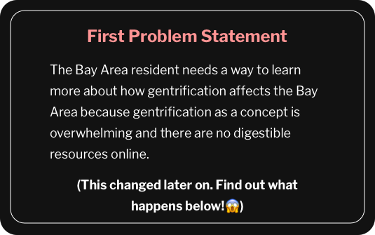
First Problem Statement.png

Something didn’t feel right….

When we revisited our affinity diagram, this problem statement didn’t seem to encompass what we had found within our research.

Both Elena and Dylan expressed feelings of being misunderstood and were very open to having a conversation about gentrification with each other.

 We prioritized this insight and rearranged our personas such that the former two secondary personas now became primary personas.

We realized that despite living so closely with one another, the Bay Area community is largely disconnected.

 
Revised persona
 

After revisiting our research, we had to reframe our problem statement to reflect our findings.

revised problem statement.png

This problem statement encompassed each user’s pain points: lack of understanding about gentrification and the need for empathy about their situation.

Reframing the problem statement enabled us to address the issue with a more holistic approach.

How might we encourage Bay Area residents to empathize with each other?

 
undraw_hang_out_h9ud 2@2x.png


Cultivating Empathy Within The Community

How do we foster connection? We knew we wanted to make the experience very personal.

From our research, we learned that people were more likely to shop and eat at businesses that were in close proximity.

We were also challenged to find a way to help people empathize with other community members. 

We developed key features to tackle this problem and decided that the site must have:

 
history.png

The historical context of your neighborhood which is a quick way to resonate with the user.

hand.png

Volunteer opportunities within the community.

speech-bubble (1).png

People’s experiences of living in the Bay Area, to create empathy for other fellow community members.

store.png

Small local businesses in your neighborhood area to promote local establishments.

birthday-and-party (1).png

Events to participate in and meet other locals.

file.png

A resources page if people want to learn more.*


*NOTE: Some people and organizations are actively involved and have been working for decades within the community as residents become affected by gentrification. We wanted to acknowledge all the work they have been doing and didn’t want this website to undermine everything they have worked for.

Mapping Out The Content

Before we could start designing, we spent quite some time organizing the content.

How can we present the most relevant content?

We had already written down the type of content that was going to be on the site but they still needed to be organized. What kind of content should go under the Resources tab? Should local organizations be under Resources or under the Get Involved tab?


Similar questions were asked as we mapped everything out. The challenge was organizing it in such a way that the placement of each piece of content made the most sense.


Sketching & Wireframing

Since our goal was to help Bay Area residents empathize with their fellow neighbors, we first had to establish a foundational understanding of gentrification in the Bay Area and how its landscape has changed.

In order to encourage and empower users to integrate within their community, I designed a personalized experience that is tailored to the user’s immediate location and offers them an insight on what’s available within their local community.

Because this project was localized to the Bay Area, I designed a flow that allows the user to:

Select their county Select their citySelect their neighborhood.

The last step was required for bigger cities such as San Francisco and Oakland and will only be present if the user had selected either of those cities.


I also designed the different types content people will see after they’ve selected a neighborhood/city. Seeing a neighbor’s personal story, local events and local organizations were all designed to encourage people to explore their neighborhood and meet other people within their community.  


BTB Banner.png

Mid-Fidelity Prototype

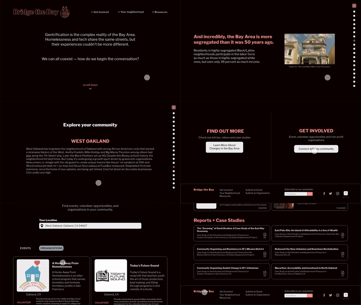
 We wanted the very first initial experience to be a continuous scroll as we walk the user through the fundamentals of gentrification. Similar to a museum exhibit, the goal was to captivate the user and maintain their attention.

When we created the prototype, we faced some constraints. The main one was that AdobeXD did not have a Scroll trigger so we had to make some modifications to the first-time user experience of the homepage. Instead of a continuous, fluid scroll, the research participants had to hit the Enter key in order to go to the next screen. Although it deviated from the original intended experience, it was a decision we had to make.

USABILITY TESTING

Testing Initial Designs


Final Iterations

My teammate Evan created a live website. Due to certain technical constraints on Wix, our exact designs aren’t translated but it captures the “museum exhibit” element that we really wanted the resident to experience. The information can be overwhelming to take in all at once so animations were added to keep the resident engaged and interested.


prototype BTB gif.gif
 

We added a Skip History button for people who wanted to weren’t interested in reading

We eliminated the Select Your County →Select Your City → Select Your Neighborhood flow and replaced it with a ZIP code input field

We changed the name of the Find Out More tab to Resources.

The Volunteer tab was completely removed and we added a volunteer section under the Organizations tab.


Final Insights

Overall, we realized that we needed to focus more on our users’ needs and pain points. Initially, we thought that people would want to learn more about gentrification but when we revisited the research, we found that users actually felt like they weren’t connecting with their fellow neighbors because they were from different backgrounds. We ended up with our problem statement of people wanting to foster connection with others because that was the recurring theme from our research.